Tuesday, 28 September 2010

New York - Sept 2010

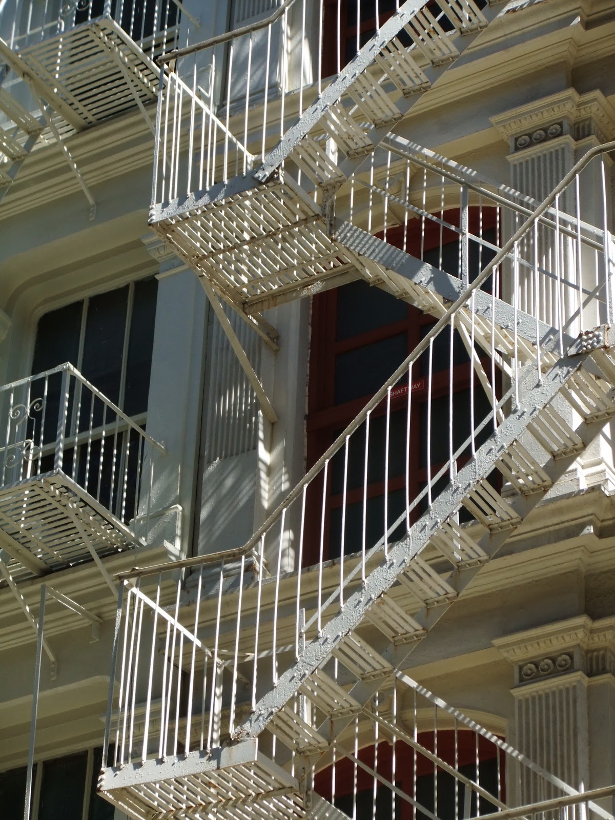
I took a birthday trip to New York and was very inspired. Some of the things I was inspired by were the fire escapes.....

 Soho fire escapes.....

 Chinatown fire escapes....


 Saw some fantastic graffiti.........


Advert in Chinatown


 Walking over Brooklyn Bridge

After a night out in Brooklyn the sequins on my top were catching the light and making patterns dance on Maria's apartment walls.


Horses and ducks.....


 View over Central Park.....


More random graffiti in Chinatown.....
 Shop front....
 'I'm way into stuff'....badges I bought at New Museum.....


 I met Jake at Bruar Falls....my iPhone has no flash so we used candles to light the pictures....I really like these shots...fun.....I have lots of New York pictures, these were just a few of my fav's. It's such an amazing city...I hope to be going back there really soon. I fell for that city in a big way......


New Project for the new school year.

 So I'm now a second year!!!!! 

Our first project is on innovation, but first we have to create a series of designs to take through to the next design stage.
I started with some of the flower images I took photos of over the Summer. I've been asked to design some merchandise for my friend Maria again. I want to update the image I did for her ep and I have a few ideas of how I can do this.


My new desk space at uni is starting to fill up with images. I like it looking busy.

There are some skateboard graphics up and some of my images from my trip to New York. I'm inspired by New York fire escapes, been drawing them quite a bit.

Friday, 7 May 2010

April/May Update

The wall covering project went well and I was pleased with the results. I managed to make quite a few backgrounds of black paper and grey acrylic paint that I then tried a few different printing processes on. 
 
 This image was black flock printed onto black and grey background.

 A little hard to see in the photo because this was black acrylic paint screen printed onto a black and grey background.

I did use the laser cutter to cut out some leaves that I used on the background. This print is a black, grey and gold acrylic paint background, with black laser cut leaves and black acrylic print on top.

One of my favourite prints. This is a black and grey background, and the image is printed using gold foil. Scrunching up the foil before hand gives a nice texture that also sticks to areas of the acrylic used on the background.

Presenting final pieces of work.

Final A1 sized print. Black and grey background with black acrylic print, gold foils and black flock.


Final project of the year is a personal project. I've decided to create patterns for glass using abstract images of flowers. 

Here are a few of my sketches.


I've been using tracing paper to try out different compositions and using Illustrator to put some layouts together. Scanning in images and rotating shapes to create patterns.

As well as using the laser cutter to engrave into perspex, I also created templates with vinyl and brown tape stuck onto glass to use in the sandblaster.

On the left is the glass with the templates on ready to be placed in the sandblaster. On the right are the glass samples with the templates removed. You can just make out the pattern left behind from the sandblaster.

Next step is engrave back into these sandblasted samples with more intricate patterns.

Thursday, 18 March 2010

Wallcoverings Project Feb/March 2010

Brief - To produce a collection of designs for wallcoverings looking at Greek and Roman sculpture and antiquity.

Inspired by Timorous Beasties black flock on a black background and also their detailed line drawings.

I did quite a few drawings from a copy of World of Interiors and an article on a recreation in a Berlin museum of Duke Moritz William of Saxe-Merseburg’s ‘Spiegelkabinett,’ which translated means ‘hall of mirrors’ or ‘house of mirrors.’ used to display artifacts.


Also looking through a book on Greek mythology I came across a skull of an athelete that still had his gold crown of leaves around his head. I liked the idea of using this image as a centre piece for my designs.


Using Gesso was an interesting idea and I tried it with some photocopies of my drawings. I did add some pale colour in and also some gold on the leaves but it did get a little lost within the layers of Gesso. Also adding a lot of layers means it takes longer to rub areas off to reveal the image underneath. There is also the risk that the wet and dry sandpaper will rub through the photocopy.


Because all my images were drawn individualy, it was quite difficult to know how to place all these drawings together in order to make a composition. The easiest way was to photocopy my designs and try fitting them together.


I knew I wanted to use the skull, so a lot of my designs seemed to work around this.


I also though about the use of the leaves and I drew up some leaves that I scanned into Illustrator and strung them together to make long garlands. These came out really nicely using the laser cutter, which isn't always the most simplest of things to use. But practice makes perfect.


I love how the black leaves look. I've thought of using them to make layers on my backgrounds.
Black paper with grey and gold acrylic and laser cut leaves with black print over the top. This was one of my text backgrounds to get an idea of how my print might look.


This is using the same background but without the leaves. The print has been printed with gold foil. Scrunching the foil paper up before heat pressing it on also meant the creases stuck to areas of the background where there had been acrylic paint, leaving interesting lines and patterns.


One of my favourite prints is this one. Using the black paper and grey acrylic paint background I have flocked the design onto it with flock paper. I love the effect of the black flock on the dark background. I think the flock shows up the detail of the lines of the drawings really well.


I am now looking at extending my ideas and taking the images to a larger A1 scale. I'm considering using hints of black and gold foil as highlights to the decoration and also more flock as I love the effect of this.

Thursday, 11 February 2010

Feb 2010 Update.


Nov 2009 - This was the start of my first main project as a 1st year. The brief was to create designs for a fashion fabric using drawing, disperse printing and Illustrator. I had to hand in 5 50x50cm drawings, 3 A3 Illustrator images and 6 to 8 A2 size disperse printed fabrics. We had approximately 6 weeks to do this, with two week rotating workshops in each discipline. The subject as you can probably tell, was flowers. My favourite being a hydrangeawhich was quite hard to get away from drawing. I decided to produce a Man's fashion fabric rather then a womens, looking at 18th Century mens clothing as inspiration.


Jan 2010 - This was the start of a short four week artist book project. This year is the 13th Annual Artist Book Fair in Leeds and Glasgow. As usual our college has several stands for the exhibition and our brief was to produce an artist book based around a chosen object and a series of repeat patterns bound into a seperate book.


My artist book was based around a vinyl figure I was bought whilst on a trip to Los Angeles in 2007. I decided to base my artist book on my trip to Los Angeles and the format of my book was a map. I screen printed a layout of the places I'd been to, along with illustrations and descriptions. I then worked back into the screen print with pen and ink. My time in L.A was bright and sunny and I wanted my images to reflect this.


 I looked at memory maps to give me ideas and also looked at the way maps are folded so I could mimic the folds for my finished map. Lastly I attached a cover with ribbon to keep the map closed. I'm really proud with how it looks. 


 In keeping with the look of my artist book I bound all my drawings, research and prints with corresponding covers and titles using the Japanese binding technique which works really well on seperate pages.


 As well as my map I also produced two mini artist books. These mini books contain only two loose pages with lino prints of an avocado and an avocado sushi roll. The books are called 'From Fruit to Roll.' One has green covers with brown prints and brown sash holding the pages together. The other has cream covers, green print and green sash. The title of the books are letters punched into copper plate, fixed to the covers.


I'm really looking forward to the exhibition. Our college has also been invited to show at the artist book fair in Amsterdam. Having a love of books means I've been really interested in the project and I feel it's something I would like to get involved with in the future.

Feb 2010 - Now the artist book project has been handed in it's time to research for the next project which is wallpaper. I was lucky enough to attend a special talk at Temple Newsam recentlyThey are currently showing an exhibition of wallpaper called Wonderwall. The curator spoke to us about the history of wallpaper and gave us a tour of the exhibition. We also had talks from Allyson McDermott on reproducing historic wallpapers and Paul Simmons from Timourous Beasties. Have to say Paul was a really nice guy, really interesting and I took a lot from his talk. It gave me ideas for my current project and how I might want to take my practice in the future.


Friday, 4 September 2009

Screen printing my scarves at WYPW.

For the last couple of weeks I've been visiting the West Yorkshire Print Workshop in Mirfield near Dewsbury. It's a fantastic and cheap facility for artists to use. So far I have printed my sushi design on silk and cotton. And I've printed my Human Rights text onto cotton. I still have my Cherry Blossom and Seed Head designs to print. I've had to learn how to coat and expose the screens, which is useful. But the whole process of screen printing can be very time consuming. I'm not sure people realise how much time it takes.

This following photograph is me setting up the red cotton material for printing. I printed onto this material with magenta which looks fantastic on the red. This scarf is going to be finished off with an orange ribbon trim.


This is me printing the purple Human Rights text scarf. I found on printing onto the cotton that I had to give it six goes for the ink to take and show up nicely on the material.


I think the purple is possibly my favourite colour of this print. The words have actually come out really well. This scarf is going to be finished with a nice deep purple ribbon trim.


The following two photographs are of one of my sushi prints. I've printed onto a silk ready-made scarf in violet and I am hand painting pink into the design. The scarf will then be finished off with a pink organza ribbon edging.